Okay after a whole long term of visual communication we arrive at the ending point of both our submission date our paste it up the wall date also the freedom day.
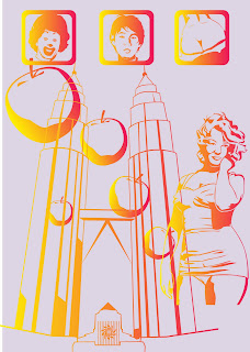
and our Final work
 our work before the spray
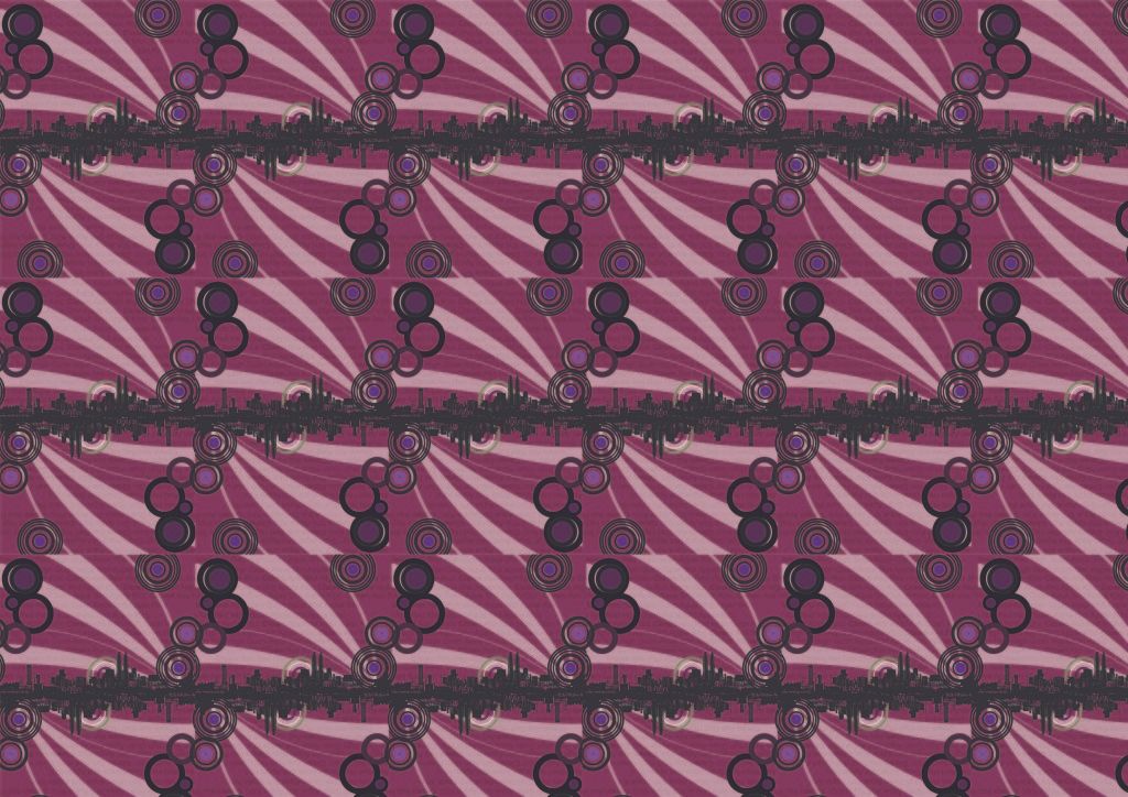
 our final work after the spray. The pic here may appear different when viewed in life due to the terribly wrong exposure of light and the angle in which the picture is taken.
Due to the fact that when the paint were screen over the paper the paper developed an irregular texture and appeared ugly. However, after the use of transparent spray to create the vintage effect, the irregular texture fell right into place perfectly to replicate the feel of a vintage wallpaper.
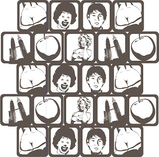
Besides the texture and the play with transparent spray, we believe our biggest attraction and specialty of our wallpaper lies in the fact that we require those who views this wallpaper to view it through the camera or a phone camera to fully see what image we are trying to show. This is no play of tricks but merely how humans choose to see things. Up close humans choose to see parts in which is comfortable to the eye and pays less attention to what is surrounding it. We choose to verify every detail on a picture if it is fully covered with colors with no blank space yet if place a big white dot or circle on the same picture, we focus only on the white space. Why is this? this is because the whole picture is irregular and out of balance in which we try to find a spot to rest our eyes. However, if the colored parts and the blank parts are balanced we would look at the picture in its whole instead of just focusing the white area.
The same applies to our wallpaper in which the white are appears to take most of the space when viewed up close and if view from far, we would actually notice that the amount of black and white are actually balanced out. Using the space we are provided we shrouded that fact and played with it in way that we are required to use a camera to view the wallpaper. The camera reduces the size in which we view the wallpaper to compensate for the distance we need to be able to identify the hidden image in the wallpaper .
~The reason~
Now for the meaning behind the wallpaper. Tracing back to our comprehension of how a wallpaper should be, it should be something which attracts and at the same time appears as if nothing was there. In other words the perfect blend in, something which catches the eyes of people yet blends into the environment as to not affect the viewers. There are indeed really really annoying wallpapers which sole purpose is to attract people but at the same time cause uneasiness to its viewers. (Some can be seen in KLCC). However, our wallpaper tries to portray the meaning of wallpaper itself and more. We wanted people to be attracted by the hidden image from a distance and yet feel unaffected when close to it. This just shows how people are able to relate to something when viewing something from a distance and when things fall upon themselves they just fail to see the big picture. Besides that we also used the potrait of a person (leaving up the gender for you to guess) to relate back to people who stay alone as to feel the existance of another though superficial so that the person who not feel alone at all. Something in which why we want a home, so that feel a sense of belonging. We may not have a real person waiting at home but at least we have a person in a wallpaper waiting for us.
We tried many other images and believe the image we used fits what we are trying to tell people the best.
All in all wallpapers are there to entertain,to decorate and to help people feel that they actually belong somewhere and own something which others don't and we want our wallpaper to not only entertain but also to attract and blend in with the environment.
We are truly satisfied with our work.
and our Final work
Due to the fact that when the paint were screen over the paper the paper developed an irregular texture and appeared ugly. However, after the use of transparent spray to create the vintage effect, the irregular texture fell right into place perfectly to replicate the feel of a vintage wallpaper.
Besides the texture and the play with transparent spray, we believe our biggest attraction and specialty of our wallpaper lies in the fact that we require those who views this wallpaper to view it through the camera or a phone camera to fully see what image we are trying to show. This is no play of tricks but merely how humans choose to see things. Up close humans choose to see parts in which is comfortable to the eye and pays less attention to what is surrounding it. We choose to verify every detail on a picture if it is fully covered with colors with no blank space yet if place a big white dot or circle on the same picture, we focus only on the white space. Why is this? this is because the whole picture is irregular and out of balance in which we try to find a spot to rest our eyes. However, if the colored parts and the blank parts are balanced we would look at the picture in its whole instead of just focusing the white area.
The same applies to our wallpaper in which the white are appears to take most of the space when viewed up close and if view from far, we would actually notice that the amount of black and white are actually balanced out. Using the space we are provided we shrouded that fact and played with it in way that we are required to use a camera to view the wallpaper. The camera reduces the size in which we view the wallpaper to compensate for the distance we need to be able to identify the hidden image in the wallpaper .
~The reason~
Now for the meaning behind the wallpaper. Tracing back to our comprehension of how a wallpaper should be, it should be something which attracts and at the same time appears as if nothing was there. In other words the perfect blend in, something which catches the eyes of people yet blends into the environment as to not affect the viewers. There are indeed really really annoying wallpapers which sole purpose is to attract people but at the same time cause uneasiness to its viewers. (Some can be seen in KLCC). However, our wallpaper tries to portray the meaning of wallpaper itself and more. We wanted people to be attracted by the hidden image from a distance and yet feel unaffected when close to it. This just shows how people are able to relate to something when viewing something from a distance and when things fall upon themselves they just fail to see the big picture. Besides that we also used the potrait of a person (leaving up the gender for you to guess) to relate back to people who stay alone as to feel the existance of another though superficial so that the person who not feel alone at all. Something in which why we want a home, so that feel a sense of belonging. We may not have a real person waiting at home but at least we have a person in a wallpaper waiting for us.
We tried many other images and believe the image we used fits what we are trying to tell people the best.
All in all wallpapers are there to entertain,to decorate and to help people feel that they actually belong somewhere and own something which others don't and we want our wallpaper to not only entertain but also to attract and blend in with the environment.
We are truly satisfied with our work.
p/s: the colored sentences is our rational incase if all the explanations and terms appears too confusing
